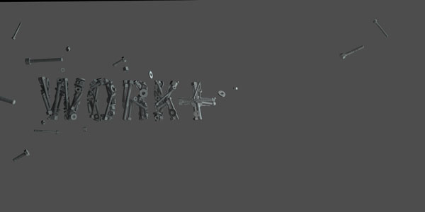
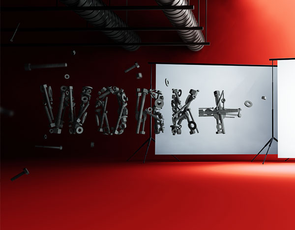
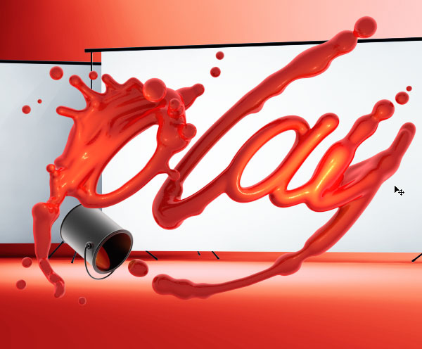
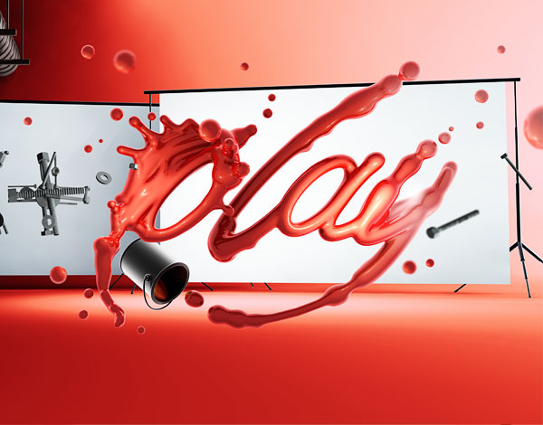
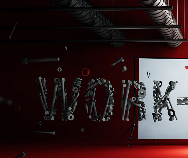
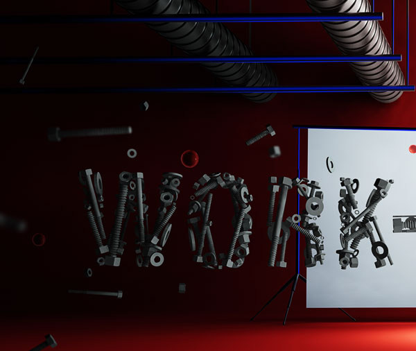
Final Product What You'll Be Creating
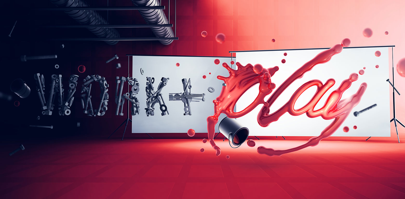
Today we’re back with the second part of our 3D typography illustration tutorial; this time we’re going to take all the pieces of the puzzle and finalize them. It’s all about realism here as we explore seamless integration of separate 3D objects into a single document. Learn how to add color, match luminosity, and add beautiful contrast to your renders.
Step 69
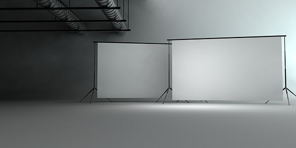
Alright, let’s jump into Photoshop and get this thing started! Open the render you made of the backdrop and ventilation shafts.
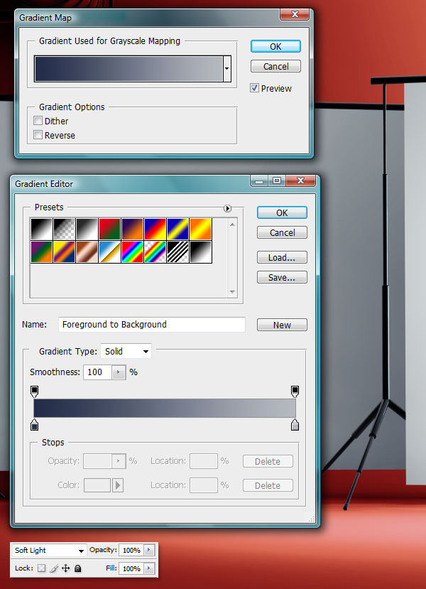
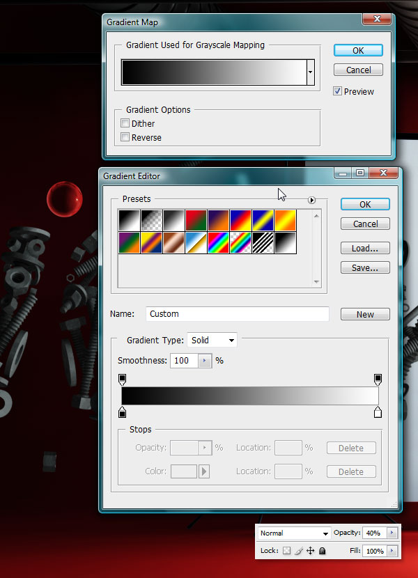
Step 70
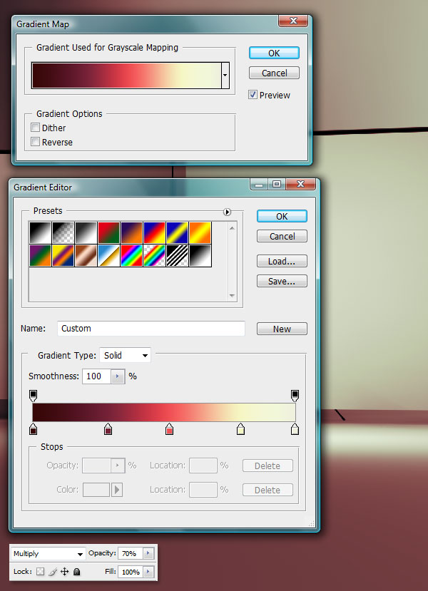
Go to Layer > New Adjustment Layer > Gradient Map. Create a Gradient Map similar to the one below. The color sequence from left to right is: #350606; #752136; #ef5054; f5f7c3; eff0dd.
Set the Layer Blending Mode to Multiply and Opacity to 70%.
Step 71
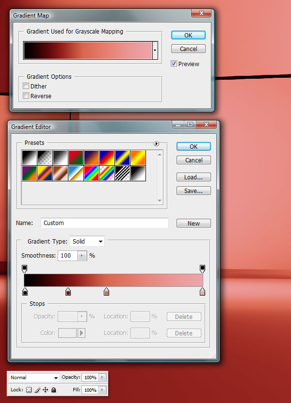
Add another Gradient Map with the following colors: #000000; #781212, #d86651; eda5aa.
Step 72
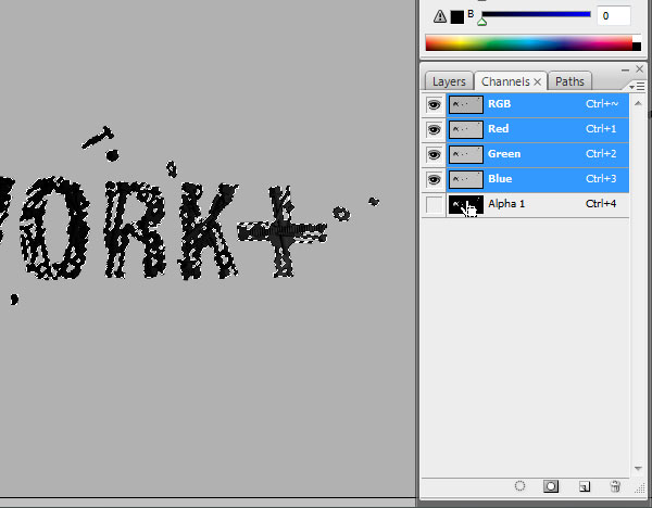
Now we’ll start to include objects into our scene, by isolating them with an Alpha Channel. I’ll demonstrate this process with the first word. First of all, open the render you’ve made.
Step 73
Now, also open the render you made that contains only the object, and no backdrop. If we would render the word with the backdrop, then the backdrop itself would show up in the Alpha Channel, leaving a selection of the entire canvas, instead of the word itself. Now open the Channels Tab and Command + Click on the Alpha 1 Channel to make a selection of its contents.
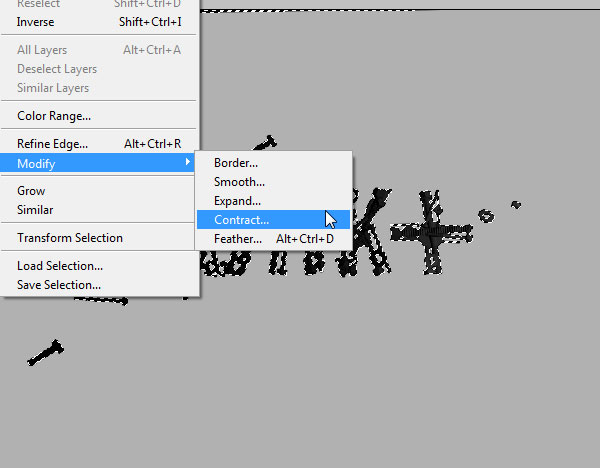
Step 74
The problem with isolating objects like this is that you get a very thin over exposed outline. To cut this out, we’re going to shrink the selection by 1 px. Go to Select > Modify > Contract. When the dialog appears, make sure the field says 1 px, then click OK.
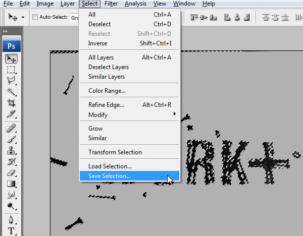
Step 75
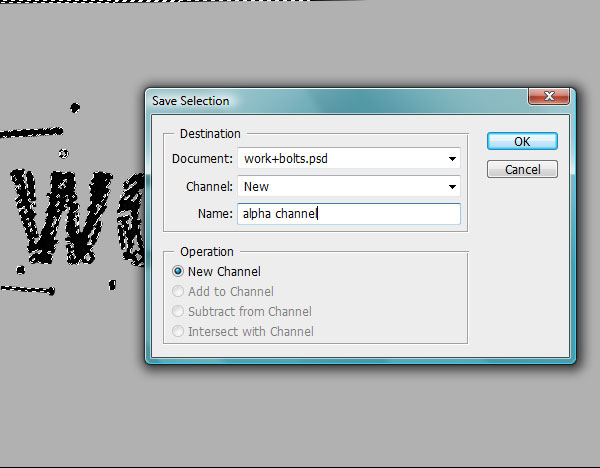
We’ll now save this selection, so we can load it up in the final ‘work+’ render. Go to Select > Save Selection.
Step 76
In the Destination Menu, select the final render that you have of the ‘work+’ word. Then name it something, like alpha channel and click OK.
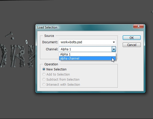
Step 77
Head over to the final render, go to Select > Load Selection, and under the Channel Menu, find the one you saved. Press OK.
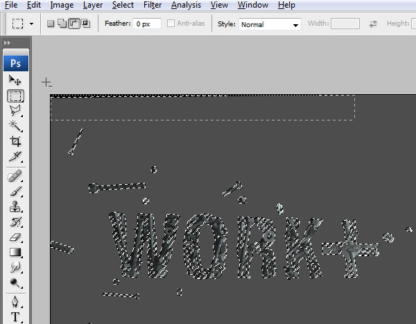
Step 78
Before I turn this into a mask, I need to fix something I didn’t notice in the render. I’ve left a part of the black ceiling in the view, so grab the Marquee Tool, hold down Alt and drag over that area to make sure it’s not selected. That area will be completely dark later on and you probably wouldn’t even be able to notice it, but it’s a worthy precaution.
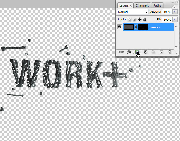
Step 79
In the Layers menu, press the Add Layer Mask button to isolate the object quickly.
Step 80
Drag this into the project and find a spot for it.
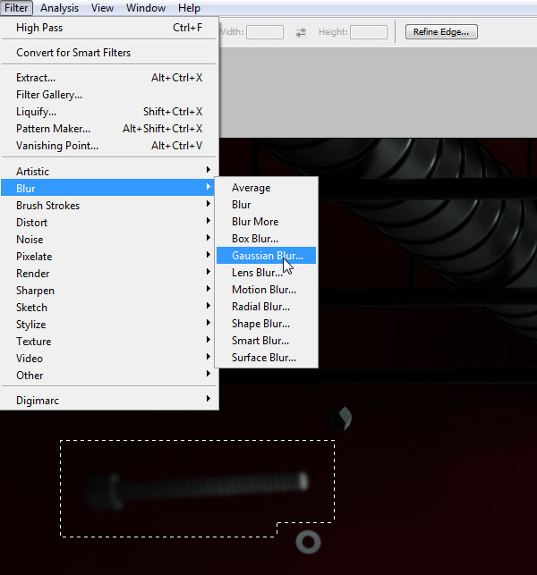
Step 81
To simulate a Depth of Field, we’re going to blur some of the bolts that are floating around. Make a wide selection (leave room for the blur to spread) and go to Filter > Blur > Gaussian Blur. I’m not using Lens Blur in this case, because that will lighten the edges of the render significantly. Since this is a dark area, we don want that. I would advise to use Lens Blur over Gaussian in most cases though.
After you applied the Blur, you may notice that the edges of the bolts aren’t blurred. That’s because you may be blurring only the contents of the image, and not its mask. After applying, don’t deselect. Go to your layers menu, find the layer you’re working on and click on the layer mask box to the right. Blur again.
Step 82
Repeat this process and cut out a version of the backdrops. Over these though, add a Gradient Map Adjustment Layer (make it a mask so it only affects the backdrops and no the background) with these colors: #222c48, #b6bac1.
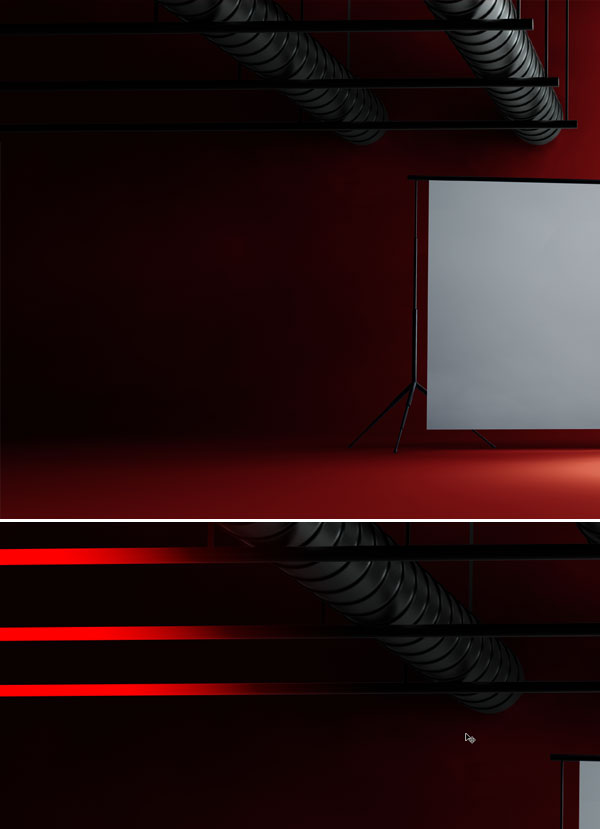
Step 83
Just like in the previous two steps, isolate the vents. I find the left side a bit too bright, so I’m going to darken it with a black-to-transparent gradient. Make it a mask so it’s only seen within the ventilation shaft render. I’ve highlighted the gradient with red in the second image.
Step 84
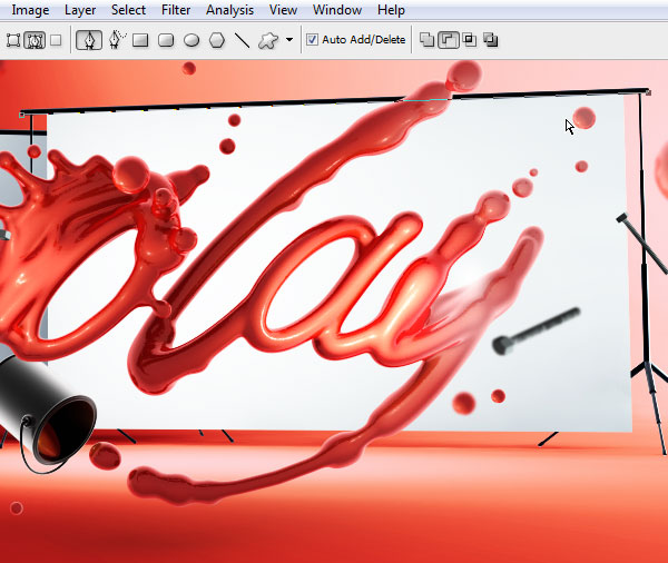
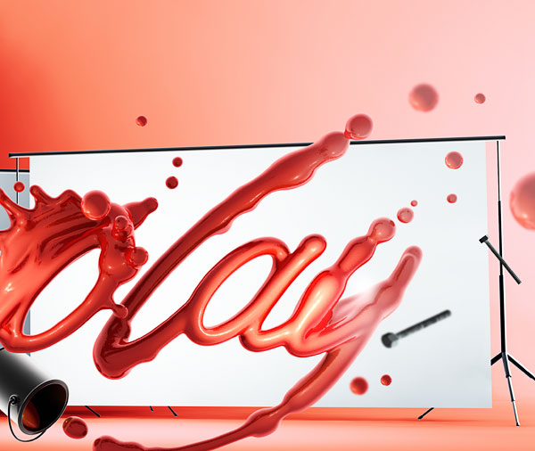
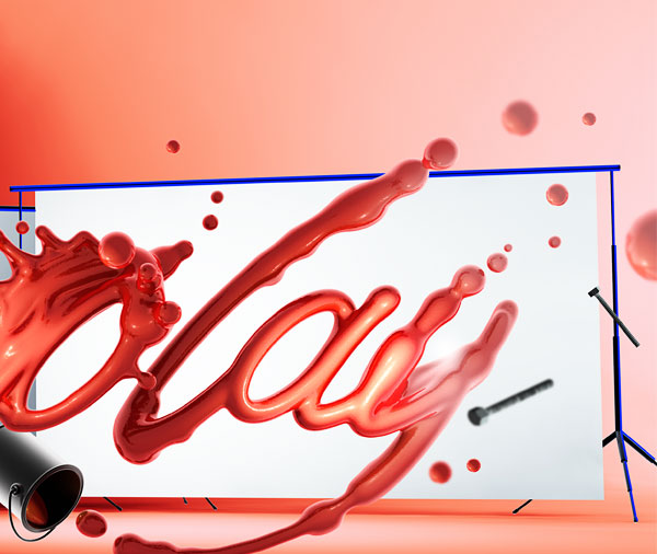
Add the final render to the document; the word ‘play’. Isolate it the same way you did with the rest.
Step 85
Make a selection of the layer, and while holding alt, remove most of the selection with the Polygonal Marquee Tool so you only have the bucket selected. Right-click inside the canvas and hit Layer Via Copy. Move this layer underneath, and don’t forget to remove the bucket from the original layer as well.
Step 86
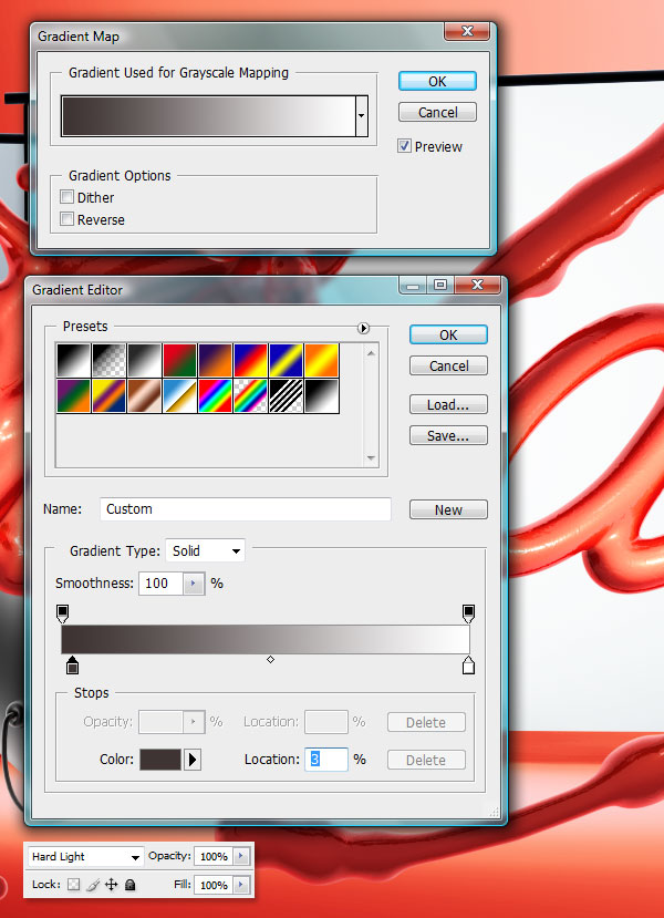
On the ‘play’ text layer, Create a Gradient Map Adjustment Layer as a Clipping Mask and change the colors to these: #1c1b1b; #ffffff.
Set the Layer Blending Mode to Hard Light. This will increase the contrast of the type and bring out those lovely reflections.
Step 87
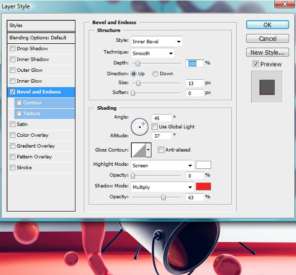
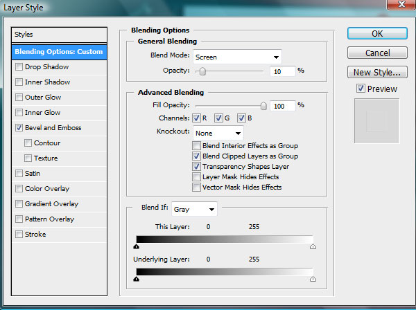
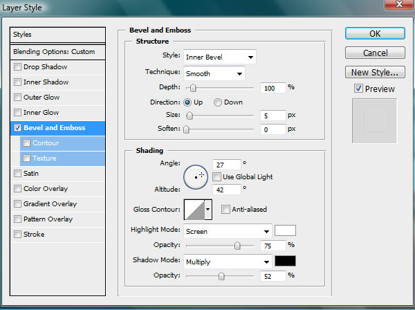
There’s one last adjustment that needs to be done to this text. Because of the pure white backdrop that we rendered this over, there’s a white reflection that’s too strong on the bottom and left side. Since we’ve isolated this from the bucket, we can just add a red soft bevel on that side, that will eliminate that white reflection. Just add a Bevel and Emboss Layer Style with these settings:
Step 88
Add a new layer as a Clipping Mask for the ‘play’ layer, and Create a few soft, white strokes that brighten the right side just a bit. They’re highlighted with blue in the second screenshot.
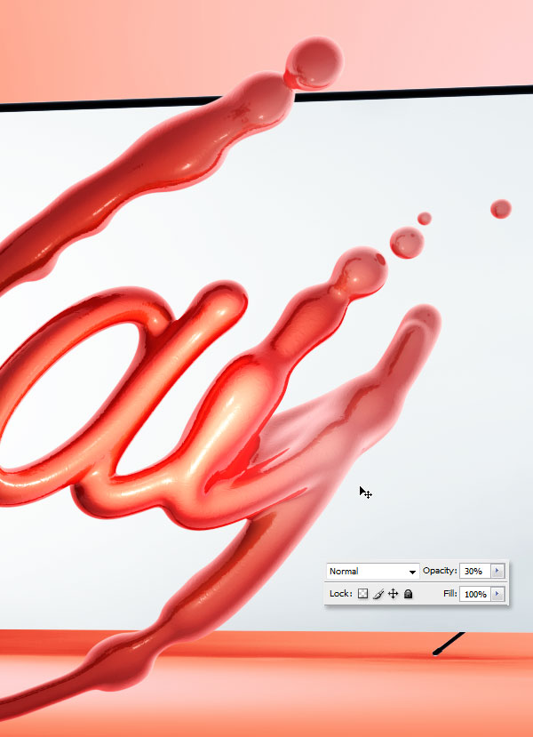
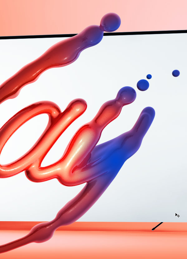
Step 89
We now need to add a few paint blobs around the scene. With the Elliptical Marquee tool, make a selection of a round blob from within the render.
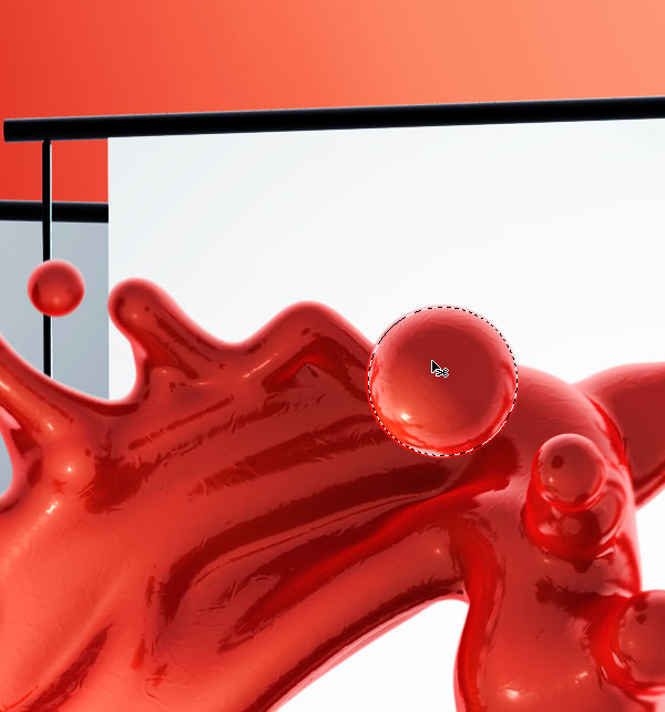
Step 90
Copy and Paste it into a new layer. Put it on the far, right side.
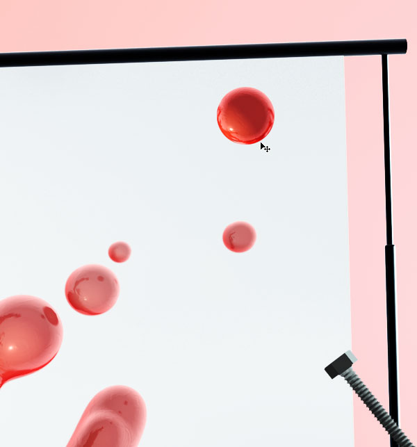
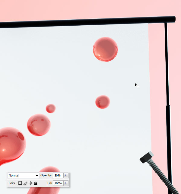
Step 91
You may notice that it’s considerably darker than the rest. That’s because the right side should be much brighter than the left. Create a New Blank Layer and make it a Clipping Mask. Fill it with white and turn down the layer Opacity to 30%.
Step 92
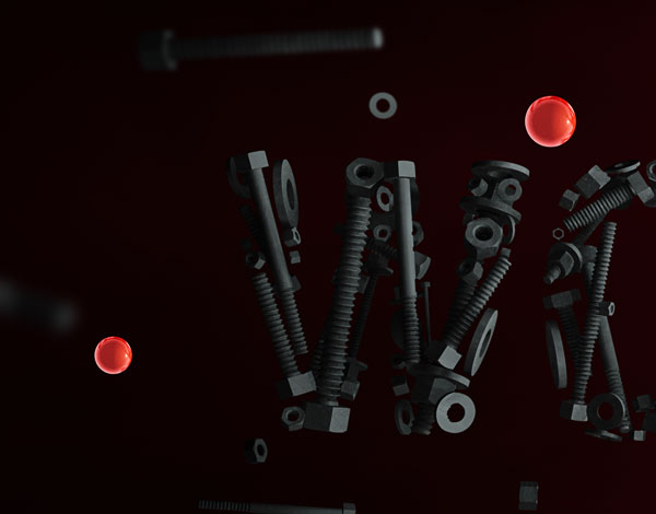
Add a few more around the scene, and remember to blur some of these out.
Step 93
Add a couple of smaller ones on the left side.
Step 94
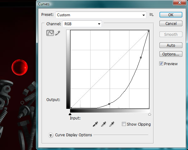
Making a black layer here on top won’t be enough for a realistic look. We also need to keep the highlight in place in order for it to look realistically darkened. Use a Curves Adjustment Layer as a Mask.
Step 95
The trouble with curves is that it also affects the colors. To tone down the color intensity, create a Black and White Gradient Map Adjustment Layer as a Layer Mask and turn down the Opacity to 40%.
Step 96
Another issue we need to fix are those tiny little highlights on the backdrop. From boosting up the contrast, they’ve all but disappeared. Use the Pen Tool in Path Mode, and on a new blank layer, trace a path over an existing highlight.
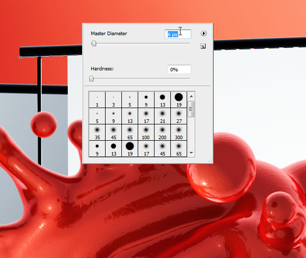
Step 97
Grab the Brush Tool (B) and change it to a soft, 6 px diameter round brush.
Step 98
Add these highlights all over the scene, where needed. As usual, I’ve highlighted them with blue for easy spotting.
Step 99
Don’t forget the right side. You may need to make these stronger, since this is the well-lighted side.
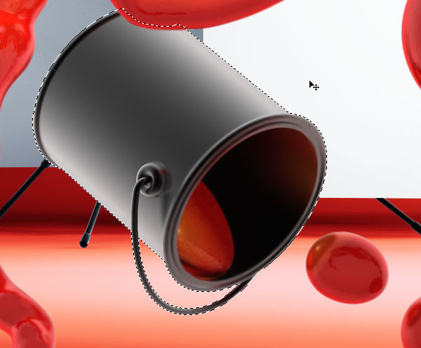
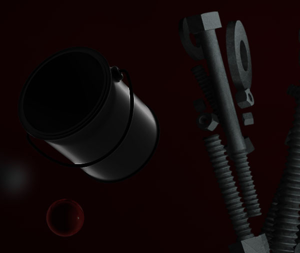
Step 100
The bucket felt a bit lonely, so I re-rendered it in a different position and darkened it a lot.
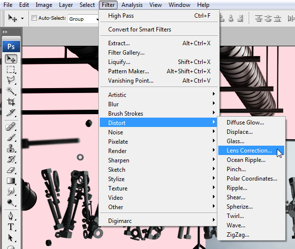
Step 101
We’ll now darken the background just a bit, so right above the first render of the scene, create a New Blank Layer and fill it with White. Go to Filter > Distort > Lens Correction.
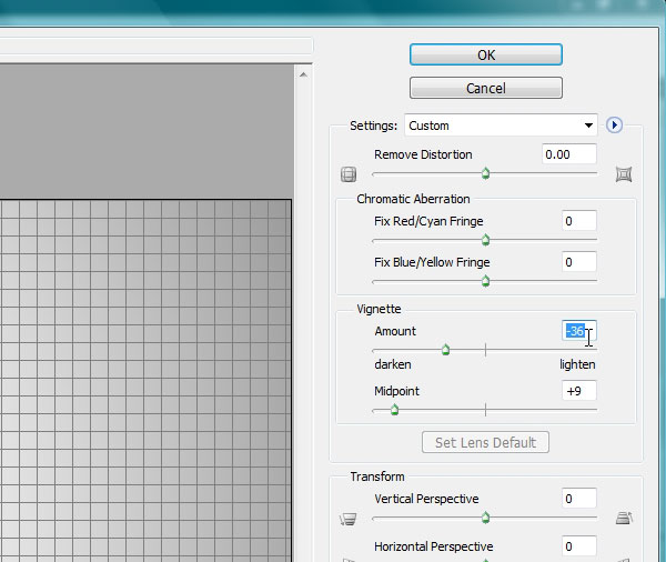
Step 102
Create a vignette effect by using similar settings.
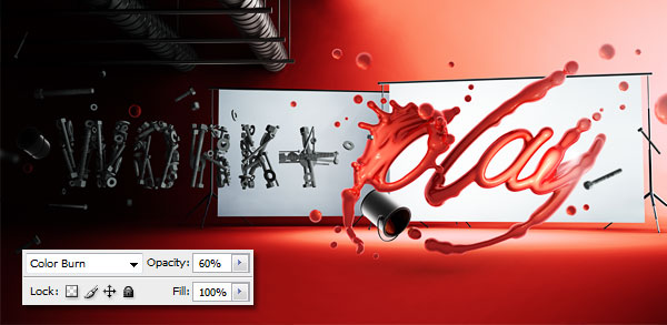
Step 103
Change the Layer Blending Mode to Color Burn and Opacity to 60%.
Step 104
For this step, we’re going to make a quick hop into Illustrator to create a pattern of Squares. Just create one, duplicate it as many times as needed to get this pattern. You can do this Photoshop as well of course.
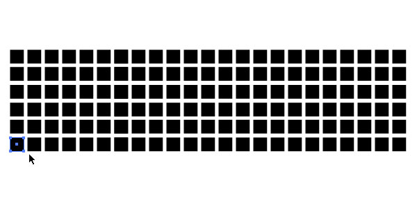
Step 105
Paste the boxes in Photoshop as a raster image, but make it really big before you flatten it.
Step 106
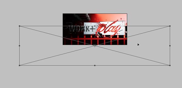
Free Transform it until you match the perspective of the floor.
Step 107
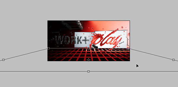
After you’ve positioned it, change the Layer Blending Mode to Screen and Opacity to 10%. Add the following Layer Effects.
Step 108
Add another one over the back of the scene. No need to change the perspective for this one.
Step 109
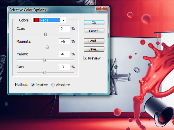
And in order to finally finish this off, we’ll add a Selective Color Adjustment Layer on top of all the layers. With this, we’re going to change the colors up a bit. In the Reds menu, change Magenta to 6%, Yellow to -4% and Black to -3%.
Step 110
Switch over to the Neutrals tab and Use these settings: Cyan: +2%; Yellow -21%; Black -11%.

Step 111
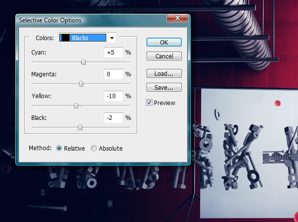
And the final one for the day is Blacks: Cyan: +5%; Yellow: -10%; Black: -2%;
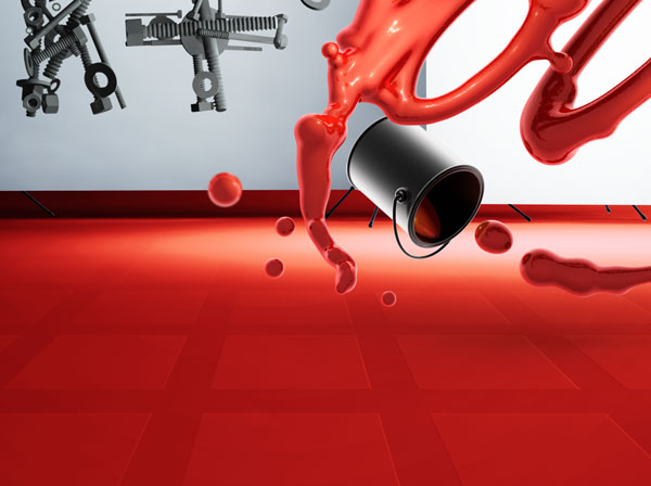
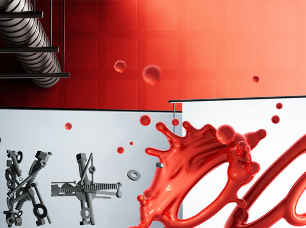
Final Image
That’s it, finally, I know! I hope it’s been a good read, that is if you’ve read a single word of it of course!
Part 1
No comments:
Post a Comment